

For many weeks we have been waiting patiently, like vultures perched on the branches of trees, for the Large Specs to go belly up and croak, and the good news is that they just have, so it’s time for us to swoop down and feast on the carcasses, the carcasses being silver and the better silver stocks, which are at good prices here, and although they have already started rallying over the past week or two, the COT structure is now much healthier, suggesting that they will continue to advance.
On the 6-month silver chart we can see the breakdown from a Symmetrical triangle that occurred late in November leading to a drop well into December, and also how silver has slowly recovered over the past two weeks. In itself this chart looks bearish, with a breakdown followed by a rally back up towards resistance, and moving averages in unfavorable alignment, and it is only when we consider the latest COTs and then look at long-term charts that we realize that the setup is a lot more bullish than it looks at first sight on this 6-month chart.

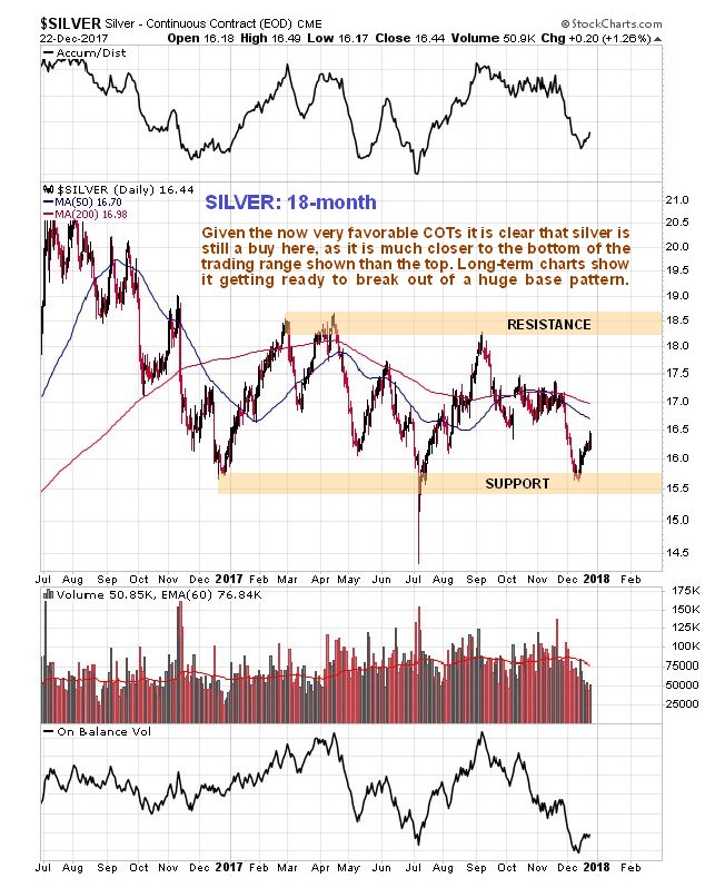
Next we will look at a 18-month silver chart, the main reason being so that we can compare the peaks and troughs on it directly to the 1-year COT chart placed below it. On this chart we can see that the silver price is within the confines of a large gently downsloping trading range bounded by approximately $15.25 on the downside and $18.50 on the upside. This chart makes clear why it turned up where it did a couple of weeks ago—it had arrived at a zone of support towards its July lows.
[The Commitment Of Traders (COT) Reports
The Commitment of Traders (COT) reports provide a breakdown of each Tuesday’s open interest for markets in which 20 or more traders hold positions equal to or above the reporting levels established by the CFTC. Commitment of Traders (COT) charts are updated each Friday at 3pm CST.
The Commitment of Traders information is available with both the Disaggregated and Financial Traders Reports.
View Forex Commitment of Traders charts here.]
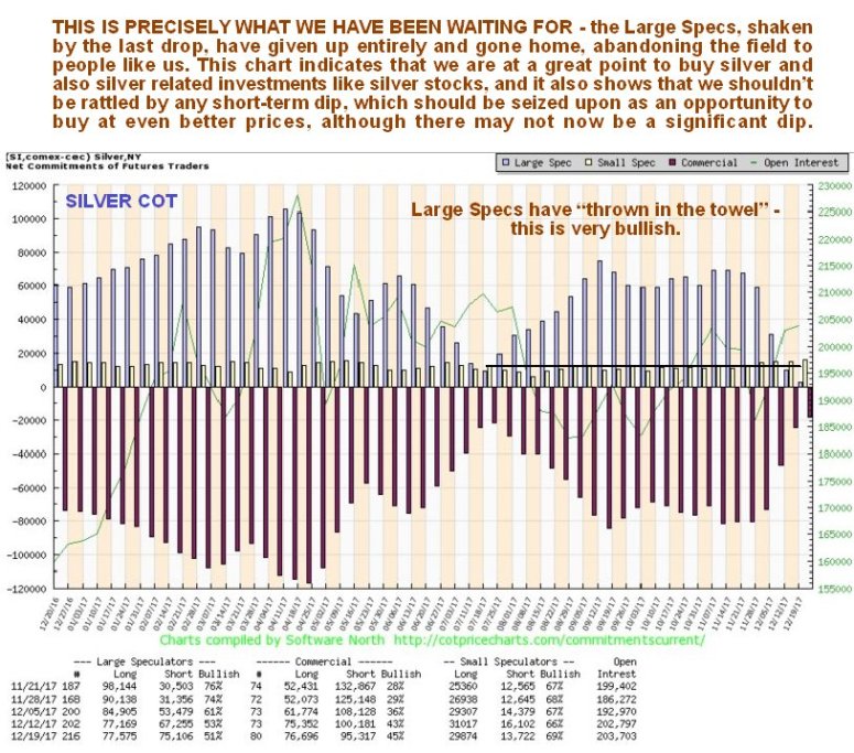
- The latest silver COT chart shows a remarkable improvement in the COT structure in the space of just four weeks, remarkable because the drop in the silver price that triggered it was not all that great.
- What this COT chart shows us is that this latest drop in the silver price was with the huge profits made by Bitcoin speculators in recent weeks making them feel like right lemons.
- If you had to give a job description for the Large Specs in silver, the most accurate one would be “bagholder” since collectively they are always wrong, and you certainly don’t want to see them with a big long position if you are contemplating buying.
- Right now they are nowhere to be seen—they have fled, which means that the coast is clear for Smart Money buyers.
- There have been some doubts expressed with respect to silver in the recent past along the lines that either it will drop to new lows, or double dip to its lows of approximately two weeks ago, but the latest COT suggests that a drop to new lows is probably out of the question, and further that while we cannot rule out a drop towards the lows of two weeks ago, it looks unlikely, and should it do so, aggressive buying will be in order.
- Here we should note that a favorable COT setup generally leads to a rally, but does not, by itself, mean that a new bull market is set to start, although it is normally a precondition for a new bull market.
- States Begin Eliminating Tax On Gold & Silver Money
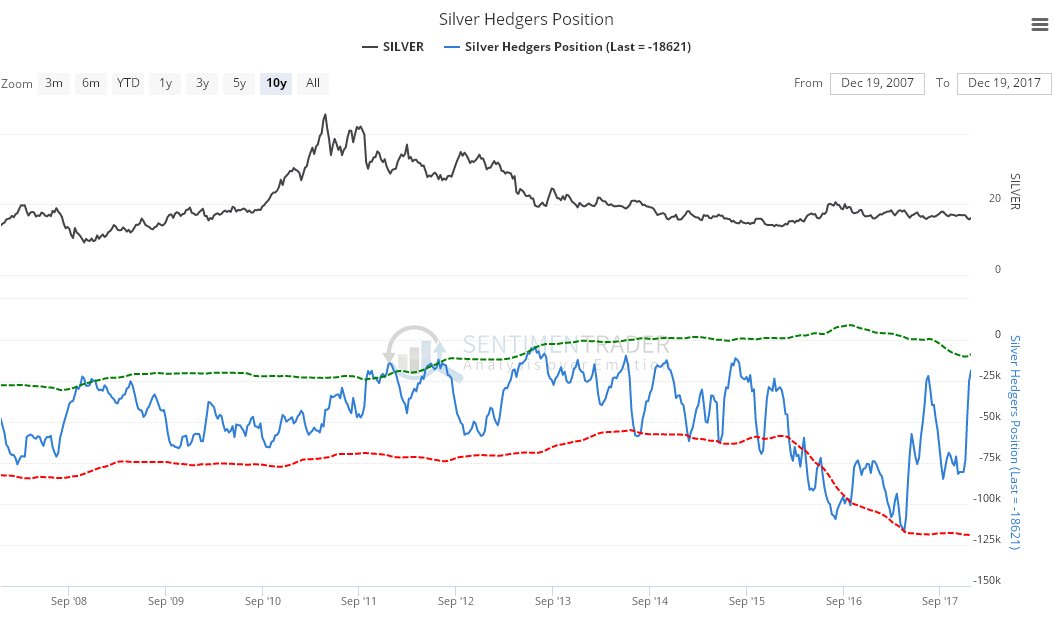
The latest Hedgers chart, a form of COT chart, also looks good for silver, and because this chart goes back much further than the COT chart, it enables us to see what happened to the silver price following peaks on this chart going back years.

The long-term 10-year chart [below] calls to mind the excellent film Groundhog Day, where a guy keeps living the same day over and over, because we just keep trotting out the same description for the long-term silver chart (which does save work). Here it is again, with some adjustment:

Like gold, silver is marking out a giant Head-and-Shoulders bottom pattern, but in silver’s case it is downsloping as we can see on its 10-year chart below, which reflects the fact that silver tends to underperform gold at the end of sector bear markets and during the early stages of sector bull markets. Prolonged underperformance by silver is therefore a sign of a bottom.
This chart really does show how unloved [orchestrated by JP Morgan & Ilk paper derivatives] silver is right now, and while we have seen some deterioration in its volume indicators in recent weeks, more important is the big improvement in the COT structure detailed above.
A break above the neckline of the pattern, the black line, will be a positive development, and more so a break above the band of resistance approaching the 2016 highs. Once it gets above this it will have to contend with a quite strong zone of resistance roughly between $26 and $28.
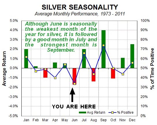
Finally, we see that silver’s best month of the year is coming right up!

The conclusion is that silver is now a strong buy, and an even stronger buy in the event that it should react back short term towards its lows of about two weeks ago. While we can speculate about why the silver price should rise soon, with reasons such as a falling dollar, and funds flowing out of the cryptos as a result of the Bitcoin bust, an attack on Iran, etc, it is not really necessary as the charts speak for themselves.
Clive Maund has been president of http://www.clivemaund.com, a successful resource sector website, since its inception in 2003. He has 30 years of experience in technical analysis and has worked for banks, commodity brokers and stockbrokers in the City of London. He holds a Diploma in Technical Analysis from the UK Society of Technical Analysts.

The unmistakable fact is that the above ground stock of silver in the world is but a tiny fraction of gold reserves and the supply of silver is relatively fixed. Hence this is a tighter market and it does not take much of an increase in demand to juice prices strongly upwards.

- Silver’s Door Step: Five Reasons to Buy ‘Physical’ Silver Now
- Global Silver Institute: Physical Silver Supply Deficit Since 2004
- Silver Industrial Demand To Increase 27% ~ Global Silver Institute 2018
- Texas Shifts Away From The Federal Reserve: State’s New Silver Gold Bullion Depository
- China “Gold Super Power” Urging Their Citizens To Diversify Into Physical Gold And Silver Since 2009

